
Wednesday, 25 July 2012
Using my title in photshop
Here is an example of my trailer poster so far, you may have noticed that I have added a dark edging to the model and to there eye socket lines to portray a dark and anxious enviroment and make my model look scared... The next blog will show the text to its full amount of editing, i will add some degrading/eroded effect to te text to make it look like it is 'expiring'/ decaying 
Creating a title for my film trailer
I have explored a variety of horror/ thriller films, such as
-The omen
-cold creek manor
-house on haunted hill
-the changeling
-panic room
-halloween (2007 edition)
And many more, futhermore I can now come to a conclusion on my films name, this being 'ExpirE'
Here is an example of my titles graphic interpritation, in which i have made with water colour,
-The omen
-cold creek manor
-house on haunted hill
-the changeling
-panic room
-halloween (2007 edition)
And many more, futhermore I can now come to a conclusion on my films name, this being 'ExpirE'
Here is an example of my titles graphic interpritation, in which i have made with water colour,
Exploring my film trailer post idea's
This is my first edit of a picture containing on of my models, who is using a knife, a mask and a examination glove as mis en scene, therefore this is showing how i am exploring the horror side of the film industry :)
Thursday, 17 May 2012


Friday, 4 May 2012
Saturday, 24 March 2012
my 'Impact' social group dress scense
My magazine follows the indipendent pop culture fashion/ indie pop.
My particular style for this magazine can be seen on many pop artists, such a 'Lana Del Ray'.
Here is a photo of Lana :

Here are some more high street fashion images to show this partcular style:


My particular style for this magazine can be seen on many pop artists, such a 'Lana Del Ray'.
Here is a photo of Lana :

Here are some more high street fashion images to show this partcular style:


Friday, 23 March 2012
Facebook feedback from general public
I have created a 'page' on facebook to allow members of the public to see visual copies of my coursework, and therefore allow them to produce there own individual personal response towrds these.
Here is the link to my page: http://www.facebook.com/MediaAsCoursework
Here is the link to my page: http://www.facebook.com/MediaAsCoursework
Thursday, 22 March 2012

Brand new artist Anna Lowe, hits it big in America after her outstanding performance from the Brit Awards in 2011, where she reveald her new song “Heaven”.This new song became viral on youtube, hitting over six hundred thousand views within a single week!
Interview between DJ SL and ANNA:
DJ SL: Ive been listening to your music, and I dont think this will be a normal QA Am I right?.Ok so, Ive heard that you really like the pop sensation Girls Aloud?
ANNA: Well you know, I love girl bands, they are quite frankly awsome. Secondly, I’ve been writting there lyrics for two years, so Alice H has been in my organsier for probably the past three years. And we have been friends ever since, constantly supporting eachother while each of us are on tour, and doing normal girly shopping spree’s!
SL: That is awsome. What do you feel about Justin Bieber, I hear you admire his admiration as a younge artist?
ANNA: He is such a star, and I must admit I am a bieber fan, haha.
SL: Really cool. How about the Scissor Sisters?
ANNA: Oh, I love them, I can't breathe. I remember the first time I heard them, it was on the radio, and I was like, 'who the heck is that?' They are a big influence. I love their mini disco through there shows, their outfits, and they really care about their performance. Conceptually I just think they're very smart, so I love them. They were big – I really thought about them when I did "moon eclipse."
SL: You have such a personal approach to other artists. Have you heard of the band Blue One?
ANNA: Blue One is like the heart and soul of my universe! I have actually been to four of their shows and they are great, and it was like we needed to work together! Blue One have been a influence in fashion for the younger generation and I admire them for this so much. I have such a admiration on artists with not only talent, but style too. David Bowie is my favourite for style and alexander higginson is my second favourite! they just blow every fashion to the season!
“Ive always loved pop music, david bowie was a inspiration and alexander higginson was just stylish!” -ANNA
SL: Very cool. What was it like filming the video for "Eclipse?"
ANNA: Oh it was so fun, it was amazing. For me it was like being on the Rocky Horror Picture set, I loved it! so me!. My budget was cheap and I loved it, very humbling, and fun. But if you ever come to a video shoot of mine one day – I'm very private about things, I don't really talk to everybody. I'm not like the party girl I am normally. I might even seem to be a bit of a cranky girl. I love to keep to myself and in my work head space worrying about costumes, the extras too. This video was a vision of mine, inspired by madonna and MJ, It was Elaine the director who wanted to do something personal, so I decided to use my dreams to express my self to the full extent!
DJ SL: Well thank you Anna I cannot stress how wacky you are and how nice! Thankyou!
CHECK OUT ANNAS NEW ALBUM POP WRECK, INCLUDES HER NEW SINGLE ‘HEAVEN’ AND HER OLD HIT ‘SOMEBODY HE KNEW’.
IN STORES NOW!
Tuesday, 21 February 2012

Friday, 10 February 2012

This is my double page spread to date, here I have shown the constant use of a colour scheme. Within this double page spread so far, I have now edited the picture on the left page to my liking, this included:
 |
| Editing the eyes of my model, to do this I created a new layer on top of the original image, I then used a smooth brush tool with maximum opacity, and drew a circle over the eyes original colour. Next I then went into layer options and then chose the layer option to become an overlay. |
 |
| Editing the teeth of the model, so they where a pear white colour, to this I used the 'sponge tool' on top of the models teeth, and therefore I edited this on the original image layer. |
 |
| Editing the jewellery of the models arms, to this I used the spot treatment brush, and selected 'created texture', I then went over the jewellery with this on the original image layer. |
 |
| Editing the background around the model, to this I used the 'magic wand tool' , changed the tolerance to '7' and then selected the props shadow. I then used a smooth 'brush tool', and selected the colour 'white' to mix in with the original background colour, and finally i used the 'smudge tool' to mix the colours appropriately. |
 |
| Adding a page number and the magazines website address, to do this I used the shapes tool and selected 'rectangle' and drew a shape on a new layer above the other layers, these rectangles used the same colour scheme as within the rest of the magazine. I then added text to a text layer above the rectangle layers, withe the appropriate text i needed. |
Thursday, 9 February 2012

.JPG)
.JPG)
.JPG)
.JPG)
.JPG)
.JPG)
.JPG)
Friday, 3 February 2012
contents page draft layout

This is my style model for my music magazines double page spread ^, this style model is from 'Q Magazine', I have chose this style model as it is showing a very modern style and theme.

This is my draft double page layout ^, I have interpreted my colour scheme to this layout and my models name to give my inclusive feel.
music magazine contents page so far
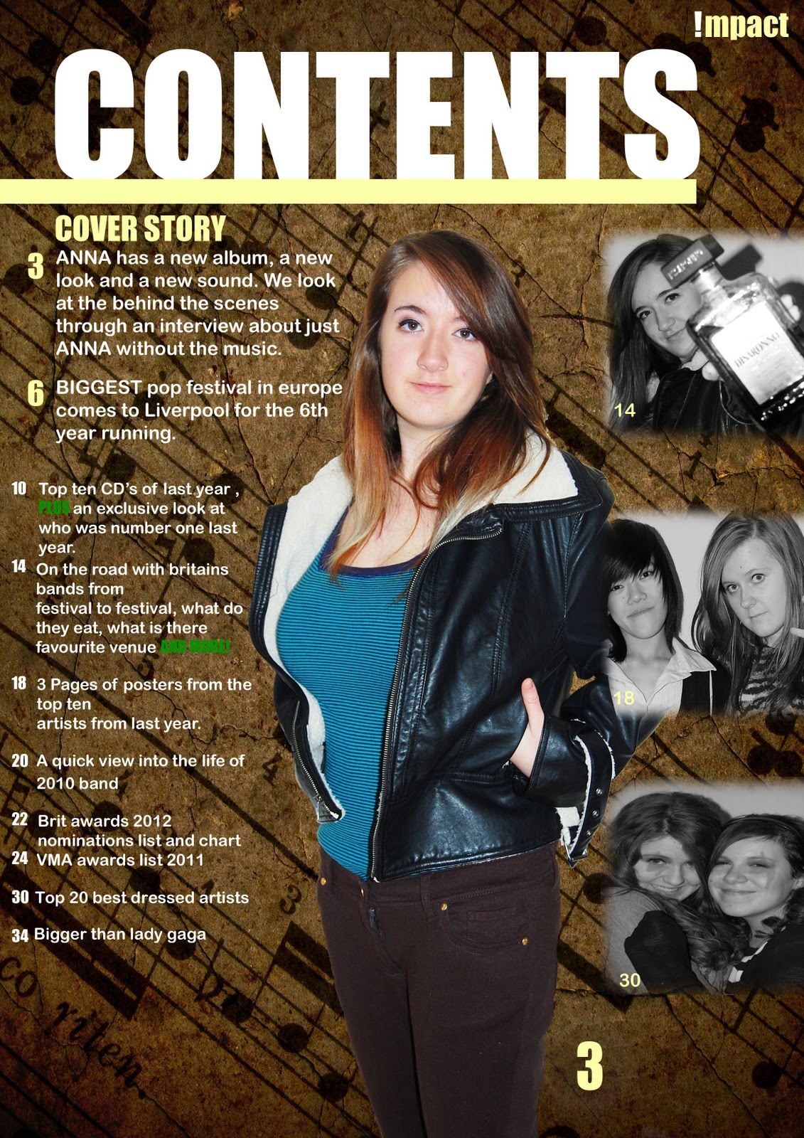
This is my contents page for my music magazine so far, as you can see I have followed the page layout design that I have previously configured. I have also followed the appropriate and trending colour scheme throughout the page, and I have also added my magazine logo at the top right of the page to show a constant theme.
Thursday, 26 January 2012
My colour scheme
My colour scheme came from the inspiration of the vintage fashion of 201, therefore I looked at trending colour schemes on the following website to see what was popular.
http://www.colourlovers.com/palette/41805/cobblestone_jazz
This is the colour scheme chart \/ \/ \/ \/ \/ \/ \/ \/ \/ \/

Therefore by using a popular colour scheme I am appealing to a wide audience, and therefore I am also using a colour scheme they have chosen themselves.
http://www.colourlovers.com/palette/41805/cobblestone_jazz
This is the colour scheme chart \/ \/ \/ \/ \/ \/ \/ \/ \/ \/

Therefore by using a popular colour scheme I am appealing to a wide audience, and therefore I am also using a colour scheme they have chosen themselves.
Wednesday, 18 January 2012
CONTENTS PAGE BLACK AND WHITE DRAFT

This is my black and white draft contents page, based on the previous billboard magazines contents page.
Contents page style model
This is my billboard style model, which I am basing my contents page on.


I am going to keep with the same layout, and I will therefore distribute my pictures in the same manor on the page. I will also distribute my text in the same manor also, although I will be using a different colour scheme to continue my house style of vintage colours.

Thursday, 12 January 2012
Final music magazine photographs


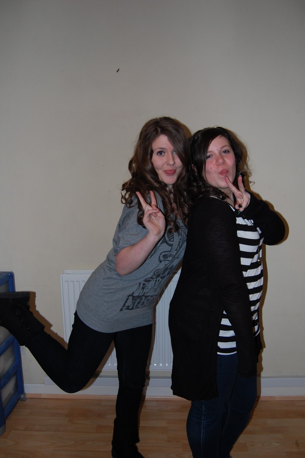


For these final photographs, I used a moderately plain background so that I could easily erase the background and therefore superimpose one in, just as in my 'Billboard Magazine' style magazine. Within these shots I also used more than one model, this was intentional as I want to create a contents page, containing different models/"artists" to give a more realistic atmosphere to the display. I also intentionally took more than one shot of each scene, this was so I could pick out the photograph with the characteristics I wanted, in case of an UN-organised error. Within these shots I also used minimal make-up so that I can photoshop my make-up in, to ensure I can try out different make-up effects and therefore then decide on which makeup I prefere, this was to save time.
Subscribe to:
Comments (Atom)